Your listing is going to get millions of eyeballs. For each 1% improvement in click-through rate, that could mean an extra $10,000 a year, for example.
The main image is one of the most important factors that gets shoppers to CLICK.
A great image vs a poor one can make the difference between a success and a flop.
Follow this guide and your results will improve, guaranteed.
Your Action Plan
Read this guide ⚠️ IMPORTANT
Create 3-5 new main images
A/B test them
Enjoy improved results
Main Image Strategy Video:
Why The Main Image is Critical 🔑
Think about it. When a shopper is scrolling…
There’s only a 4 things a shopper can see:
The main image
The price
The reviews
The title
Shoppers are glancing at these things very fast! For many shoppers, it’s the visual aspect of the image that they look at most. So that is why you must A/B split test your main images! And the amazing the amazing part is, you can now do this in Seller Central – it’s an amazing new feature.
So that is why you must A/B split test your main images! And the amazing the amazing part is, you can now do this in Seller Central – it’s an amazing new feature.
Have I mentioned that the main image is critical. Think about it. When a shopper is scrolling, there’s only a few main things they see…
the main image
the price
the reviews
the title
How many main images should I test? In short, a lot. I say at least 3, but ideally test 5. Or if you want to go all out, 10! The main image is critical to getting clicks, so it’s well worth it. Start by testing A vs B, then test the winner vs C, then test the winner vs D, and so on. There are many different concepts you can try out for the main image. In my opinion, it’s a no-brainer because it’s easy to do and it is one of the HUGE levers to getting more sales! By thoroughly testing main images, you can potentially 2X your sales overnight! It’s been done!
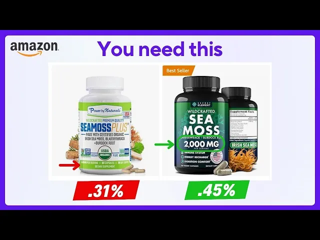
The below image demonstrates how on most bottles, the size and count is too small to read. The green arrows indicate bottles where you can see it at a glance. Overall, bigger is better!

In the ‘products based on this item’ section, images are even smaller! So you should think about this as well when considering how big to put the key info in the main image.
Why You Must A/B Test Main Images
It's simple. If you don't, you will be missing out on a lot of money. Your initial main image is rarely the best performing one.
Follow this guide to strategically test your main image. By doing so, your CTR and CVR will be fully optimized, so you will make more sales and more profit.
Proper testing can boost sales by a significant amount.
See the below case study of 50-75% sales boost.
I. Making Main Images
What Makes a Good Main Image?
The purpose: allow the shopper to understand what is is as easily as possible – at a glance.
Clearly shows what the product is
Highlights key and/or unique features
High quality, zoomable (2000×2000px is best)
For non-consumables:
Make it easy to understand what the product is at a glance & why it's unique
Show any bundled items that come with it
Research competitors and try to make your main image have unique 'vibe' so it stands out
Test out different product angles
🔑 Make Key Info BIG on the Main Image
Get 3D renderings of the bottle because 1) They often look better than real photos. And 2), even more importantly, you can easily edit what’s on the label - for the purpose of the main image.
You want to be able to edit the label for purposes of the main image, because it’s very important to A/B test the main image – which will essentially be a picture of the bottle.
Think about this. What is the key info that customers are looking for? Make that boldly visible. Use complementary or opposing colors.
Your Checklist
Get an designer who is an Amazon expert and specializes in designing Amazon main images (or else its a waste if they don’t specialize in this)
Get a 3D rendering made
Make the key info very large on the label
Milligrams/grams
Size/count
Key benefits
Key ingredients
Key features
Use complementary and/or opposing colors to make key info stand out and very easily ‘glanceable’
How to Make Alternate Main Images
Before You Start A/B Testing, You Will Need to Make Some Alternate Main Images.
First you will need to create some alternate main images. If you cannot do this yourself, get a creative graphic designer to do it.
Think about how to improve your main image so it catches more attention, and/or key information is easier to understand at a glance.
Example to follow:
Main Image A) Your current main image.
Main Image B) Just make the product bigger. Simply make sure bottle fills up the entire main image.
Main Image C) Show the capsules/gummies alongside the bottle.

Main Image D) Edit the image on the bottle and make the MG, COUNT and SERVING SIZE very LARGE. To do this you will need to get the editable label file and have a photoshop expert do it.

Main Image E) Make a main image with the box alongside/behind the bottle. This is a hack that allows you to show more key info in large text on the main image.

II. How to Set Up A/B Tests
Step 1) Go to Manage Your Experiments
Go to Manage Your Experiments in Seller Central: https://sellercentral.amazon.com/experiments/dashboard.

Step 2) Create New Experiment
Click Create a New Experiment → Product Images.

Step 3) Upload Main Image B
Choose the ASIN you want to test → Upload Main Image B → Uncheck “Experiment with supporting images” → Schedule Experiment.
You want image B to be clearly different than the current one.
Click Schedule experiment

Step 4) Edit Details
Click View Details to change the details.

By default, I like to set to 4 weeks because this is the shortest duration.
Click Edit → Set Duration → 4 weeks (the minimum) → Submit Chances
Select "Start my experiment sooner if possible". By default it will set an automatic start date which is about 1 week in the future.
Select "Automatically publish the winning version"
It may take some time to get approval. Check back in a 24 hours to make sure it did not fail validation.
Step 5) Wait for Results, Analyze
Set a reminder to check back when the test is done.
Analyze the results.
Step 6) Repeat 2-3x
Don't stop after the first test!
Next, test the winner vs Main Image C.
After that, test the winner vs Main Image D.
Keep repeating rounds or until you’ve tested all of your main image ideas.
Step 7) Enjoy improved results
Now you know that your main image has been thouroughly tested & optimized for the long term! Some products can see up to 75% improved sales just from this!
How many main images should I test? In short, a lot. I say at least 3, but ideally test 5. Or if you want to go all out, 10! The main image is critical to getting clicks, so it’s well worth it. Start by testing A vs B, then test the winner vs C, then test the winner vs D, and so on. There are many different concepts you can try out for the main image. In my opinion, it’s a no-brainer because it’s easy to do and it is one of the HUGE levers to getting more sales! By thoroughly testing main images, you can potentially 2X your sales overnight! It’s been done!
How to Analyze the Results
When an experiment is done, it shows you this data chart. The key metric to look at is Units Sold From Search. This means that you got more clicks in search – meaning a higher CTR.
For some reason, it does not show CTR (click through rate) specifically… It appears that Amazon is only measuring conversion data and not click data. I certainly hope they release CTR experiments.
The only way to AB test CTR specifically is to do it manually.
The rest of the data is more useful when testing gallery images and A+ content because it has to do with CVR (conversion rate).

Units Per Unique Visitor - This is calculated by dividing the total number of units ordered by the number of unique visitors who participated in the experiment. It's important to note that only those visitors who were exposed to the experimental content are included; not every visitor to the product detail page is counted.
Conversion Rate - This metric represents the ratio of customers who made a purchase to the total number of customers included in the experiment.
Units Sold - The aggregate of units purchased by customers during the experiment.
Units Sold From Search - This includes units purchased by customers who encountered the product through the search function on Amazon during the experiment.
Sales - Represents the total sales from all product offerings to customers participating in the experiment.
Sales From Search - Accounts for sales from all product offerings to customers who discovered the product via the search page during the experiment.
Sample Size - Refers to the total number of unique shoppers who were logged in and saw the experimental content. Note that not all shoppers who visit may be counted as part of the experiment. Variations in sample size are considered normal, and adjustments are made during result calculation to account for these differences.
III. How to Optimize the Packaging Image for Higher Clicks
Make Sure Key Info is Easy to See
Step 1) Get a 3D rendering of the bottle (and packaging
Why get 3D renderings?
Editable
You can easily play with what’s on the label & packaging.
They Look Better
3D renderings often look better than real photos.

Step 2) Determine the key info
Think about the key info that customers are considering.
For supplements, it's this:
Milligrams/grams
Size/count
Servings
Also it might be this:
Key benefits
Key ingredients
Key features
Step 3) Make key info larger
The purpose is so shoppers can understand the product just by glancing at the main image.
Keep in mind, they may not read the title!
Use complementary and/or opposing colors to make key info stand out and very easily ‘glanceable’
The below image demonstrates how on most bottles, the size and count is too small to read. The green arrows indicate bottles where you can see it at a glance. Overall, bigger is better!

But my physical packaging won't match the main image! Don't worry. It's fine if they don't exactly match. Customers won't care.
Main Image Ideas
Main Image Ideas for Supplements
Here are some examples of different styles of main images.

Showing the back of the bottle. Showing a highlight bubble “Advanced weight loss”. Showing the gummies next to the bottle.

Show the box. This is something to test.

Showing the box: this is a good strategy to test beacause you can put more info on there.

A very large box and a small bottle. It's an idea to consider.

Showing the powder inside the capsule. Also “30-DAY SUPPLY” is large and easy to read - good.

The box on the right is poorly lit - bad.

Show the flavor by putting the fruit, e.g. an apple.

Clear bottle so you can see the gummies inside.

Good example of showing the key numbers in large, glanceable form. 500MG, 240 CAPSULES, 240 SERVINGS.

Show the capsule and the fruit.

Showing the ingredient / herb flower.

Wide bottle = fills up the whole image.
Case Study: 45% Increase in CTR
For this healthy snack product, it's hard to tell by the main image how big the bag is actually. In reality, it's a pretty big bag – truly a value size. So we added "1.5 lbs" and "20 Servings - Value Pack".
We drastically improved CTR for a client selling healthy snacks after adding the size and servings in large text on the main image.

Amazon Growth Hack #65 – the Main Image Hack that increased sales 22%
A fully optimized & tested main image is critical for profitability. This cannot be understated. A great image vs. a poor one can make the difference between a profitable product and a flop!
Copy my playbook:
Step 1) Strategically design 3-5 main images
Get your Amazon expert designer to design up some alternate main images.
For example :
A) Make the bottle fill up the entire image
B) Edit the image on the bottle and make the MG, COUNT and SERVING SIZE very LARGE
C) Show the capsules/gummies alongside the bottle
D) Show the box alongside/behind the bottle. This is a hack to show any key info in large text. Below is a good example of our client Bold Botanica. You can easily see “30 Capsules” and “Women’s Health” at a glance the box. This important.
See more ideas later in the guide
| |
|---|---|
Showing the box: this is a good strategy to test because you can put more info on there. | Show the capsule/gummy alongside the bottle |
Step 2: Run the A/B Experiments
Make sure to test at least 3 main images. ****This means running at least 2 rounds of tests. Don’t stop after the first round! For best results, test 3, ideally 5, main images to determine the ultimate winner. Even Amazon recommends “running multiple back to back experiments”.
Step 1: Go to sellercentral.amazon.com/experiments
Step 2: Click New Experiment → Product Images
Step 3: Add Main Image Variation B
Step 4: Uncheck “Experiment with supporting images”
Step 5: → Set Duration to 4 Weeks (or check “To Significance” if the ASIN is high traffic - sells more than 500 units per month) → Select start date: soonest date available → Check “Start my experiment sooner if possible.”
Step 6: Click Schedule Experiment
Step 7: Check back in 4 weeks
Step 8: Repeat & repeat: test the winner vs the next main image idea. Keep repeating this until you have tested all main image ideas.
💰 Long term, this simple hack will likely make you an extra $10,000 of the product’s lifetime
Case Study: 22% increase in sales
Just by testing the main image, sales increased by 22%.
We had a white iPhone for the longest time. Then I had the idea if a more vibrant color iPhone would get more clicks & sales. So we tested it vs an orange one, and sure enough, it performed better.
But luckily, we didn’t stop there! The next text of orange vs blue was incredible! Had we just called it good after the first A/B test, we would’ve lost out on almost double the sales! The blue turned out to perform almost twice as well as orange. Gotta love it!
Round 1: Orange outperformed white!
Results
Units sold: 88 → 108 = 22.7% increase in sales


Round 2:
Results:
Units sold: 21 → 38 = 81% increase!
Analysis
Blue performed nearly 2x better than orange! 🤯 This was mind blowing.
Next steps:
Run this same experiment again for 8 weeks to verify & get more data
Run this again every September with the newest iPhone Pro color

Recap: Sales were in increased significantly with just two rounds of main image testing.
How to Be Eligible for A/B Testing
You must Brand Registered and the ASIN must have “sufficient traffic”. Amazon states this means ”at least several dozen orders per week”. It kinda makes sense. Without enough traffic, you can’t run a sufficient AB test.
Sufficient traffic
Brand Registered
Main Image – Tips & Tricks
Think about how to stand out from competition.
Get creative and think outside the box about how you can make your main image stand out. Research competitors to see what’s out there. But don’t limit yourself to existing ideas!
Make sure to test at least 3 main images
This means running at least 2 rounds of tests. Don’t stop after the first round! For best results, test 3, ideally 5, main images to determine the ultimate winner. Even Amazon recommends “running multiple back to back experiments”.
Step 1: Go to sellercentral.amazon.com/experiments
Step 2: Click New Experiment → Product Images
Step 3: Add Main Image Variation B
Step 4: Uncheck “Experiment with supporting images”
Step 5: → Set Duration to 4 Weeks (or check “To Significance” if the ASIN is high traffic - sells more than 500 units per month) → Select start date: soonest date available → Check “Start my experiment sooner if possible.”
Step 6: Click Schedule Experiment
Step 7: Check back in 4 weeks
Step 8: Repeat & repeat: test the winner vs the next main image idea. Keep repeating this until you have tested all main image ideas.
Make sure Version A and B are clearly different.
At first, test styles that are very different. Then, once you figure out which style is best, make smaller changes to refine what works best.
Use a creative expert that knows Amazon.
Not all graphic designers are well-versed in Amazon strategy. It’s important that the designer is an expert at Amazon marketing. Main image strategy on Amazon is different than on Shopify!
Test in 4-week blocks.
Amazon recommends 8-12 weeks, but 4 weeks should be fine, as long as there is enough traffic. Make sure to let the experiment run its full course.
Test one ASIN at a time.
A best practice is to consistently use the same ASINs for each variation in the experiment. Avoid using the experiment to compare different ASINs. Ensure each test version is applied to identical ASINs before starting the experiment.
Run A/B tests once a year
A crucial strategy is to conduct A/B testing regularly, across various seasons. This allows you to deeply understand your audience and their preferences, which is key to boosting sales and profitability. Regular A/B testing is an effective method to gain insights into your audience's needs.
Manage Your Experiments FAQ - From Amazon
Recap: Main Image Best Practices
Arguably more important than the title
High resolution - at least 1500px on the shortest side
Show accessories included
Highlight the USPs where possible
Make sure to Split test at least 4 variations in Manage Experiments in Seller Central
Make the product fill up as much of the image as possible
White background, No icons or logos
Conclusion
The main image is a very important piece to success on Amazon. Testing them is a no-brainer way to maximize results. Don't be afraid to think outside the box. The perfect main image takes some creative thinking.
For more info: here is Amazon's Manage Your Experiments FAQ
Want my agency to implement this for you? Get in touch at amazingmarketingco.com.
Ultimate Guide: Amazon Main Image Strateg
Riley Bennett